
Create a Wavy Text Effect with Pure CSS
Looking for the perfect effect for your Mermaids-Are-Real conspiracy website? Look no further!


Playing around with CSS can help us give our websites that extra-sophisticated look by creating interesting effects and animations. Ever wanted to show your clients or visitors just how chill you are? Why not do it with a wavy text effect? 🌊
This is the first tutorial of my upcoming Pure CSS Text Effects series, where I'll show you how easy it can be to add a nice touch to your text with plain ol' CSS.
For this one, I'll walk you through adding a wave-like animation using a pretty cool property: clip-path.
Clip-path property?
The clip-path CSS property, as mentioned in MDN docs, creates a clipping region that sets what part of an element we want to show. The parts we select within a region will be seen, while the other parts will be hidden.
This property comes with a set of basic shapes you can “crop” your elements in: inset (rectangles), circle, ellipse, polygon, and path (which lets you crop a shape based on an SVG).
I won’t go into the details (mainly cause I'm not that versed in this property yet, but also cause I don't want to wander too far away from the main purpose of this tutorial).
If you want to learn more about it and see some of the things you can create with this property, I highly recommend exploring MDN docs and CSS Tricks.
HTML
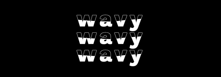
To achieve this effect, we'll use two main HTML elements: one will work as the border/outline for the text, while the other one will be the "filling", which we'll animate using our beloved clip-path property.
<h2 class="border">wavy</h2>
<h2 class="wave">wavy</h2>
And... that's it. Now let's move onto the CSS!
CSS
We'll start by setting our display behavior to flex, choosing a font family, background color, and centering our text. You can choose whichever font, colors and size you want:
body {
    background: #faf8f7;
    height: 100vh;
    width: 100vw;
    display: flex;
    align-items: center;
    justify-content: center;

    font-family: "Work Sans", sans-serif;
}
We'll modify the properties for our h2 elements directly, making sure to set the position to absolute. This will allow us to have one element right on top of the other:
h2 {
    font-size: 15vmin;
    position: absolute;
}
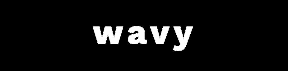
We'll now set our text outline and color:
.border {
    color: black;
    text-shadow:
       -1px -1px 0 white,
       1px -1px 0 white,
       -1px 1px 0 white,
       1px 1px 0 white;
}
This is what our text should look like by now:
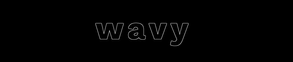
And finally, we'll define the color for our waves, as well as an animation, in which we'll use the clip-path property to simulate the movement:
.wave {
    color: white;
    animation: shift 3s ease-in-out infinite;
}
At this point, you'll see the text in its entirety:
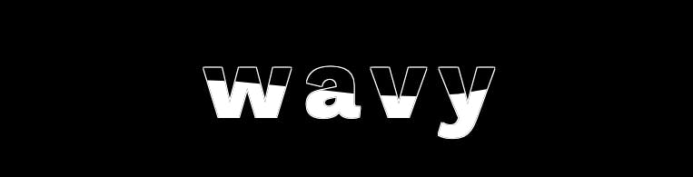
Now comes the toughest part! To simulate a wave motion, we'll clip our element using the polygon() CSS function. By playing around with it, we'll hide portions of the text.
The way the clipping is done is by defining percentages to move around the x and y axis of our elements. We can create anything from a simple rectangle, to a very complicated shape. Luckily for us, there's existing tools that help us visualize different shapes: check out Bennett Feely's Clippy tool.
Add the first instance of our animation, which will show you how the clipping works:
@keyframes shift {
    0%, 100% {
        clip-path: polygon(0% 47%, 10% 48%, 33% 54%, 54% 60%, 70% 61%, 84% 59%, 100% 52%, 100% 100%, 0% 100%);
    }
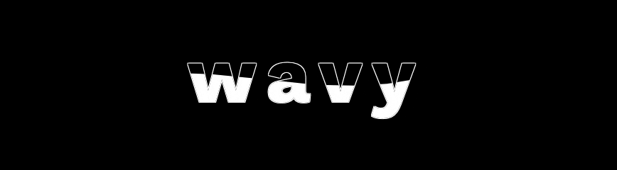
And finally, add the last bit of our animation, which should now crop our text almost inversely:
    50% {
        clip-path: polygon(0% 60%, 15% 65%, 34% 66%, 51% 62%, 67% 50%, 84% 45%, 100% 46%, 100% 100%, 0% 100%);
    }
Resulting in this:
And that's it! You can find my entire code up on CodePen:
Thanks for reading! Know of other ways to do this or ways to improve it? Please don't hesitate to share them with me, I'm more than happy to learn.
You can find me on Twitter and CodePen.
Happy coding!