Growing up playing games on my GBA (especially Pokémon and Harvest Moon) I've always been fascinated by pixel-art and its inherently retro look.
When I started learning HTML and CSS back in September, one of the very first properties I discovered was box-shadow, which lets us add shadow effects around our elements.
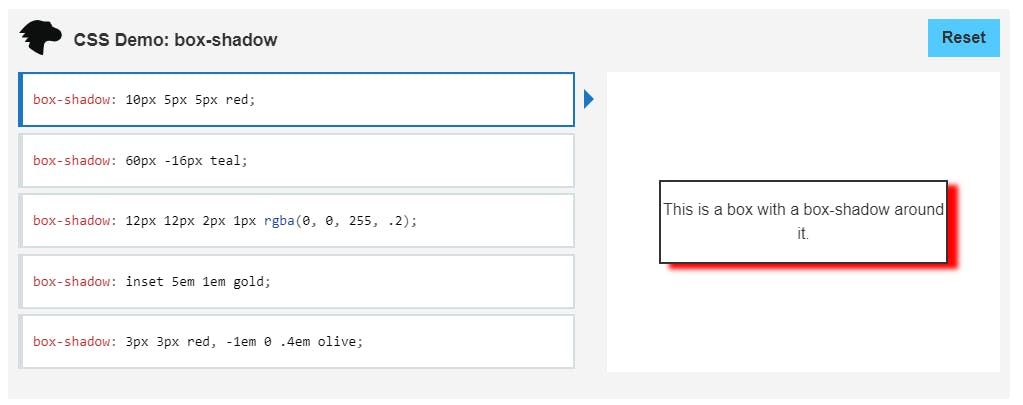 As stated in MDN , this property is described by X and Y offsets, blur, spread radius, and color, all of which give us many opportunities to play around and create different things. One of these being pixel-art.
By creating a single HTML element and using box-shadow's X and Y offsets, we're set to start drawing with pixels. I'll show you how & walk you through a few examples:
Creating Pixels
We'll start by creating an HTML element with a "pixel" class. In our stylesheet, we'll make our background transparent and start working with box-shadow. Since we're doing pixel-art, we'll assign a height and width of 1px. Here's our code and how it looks:
.pixel {
  background: transparent;
  height: 1px;
  width: 1px;
  box-shadow:
    1px 0, 2px 0 red, 3px 0 green;
  transform: scale(20);
}

As you can see, by creating a transparent 1px by 1px square, we can move our box-shadow to the sides and add color to "draw" with pixel squares. At this point, you can probably tell where this is going. ;)
Creating Pixel-Art
Looking closely at any piece of pixel-art, we'll see how they're basically made of a colored pixel grid/matrix:
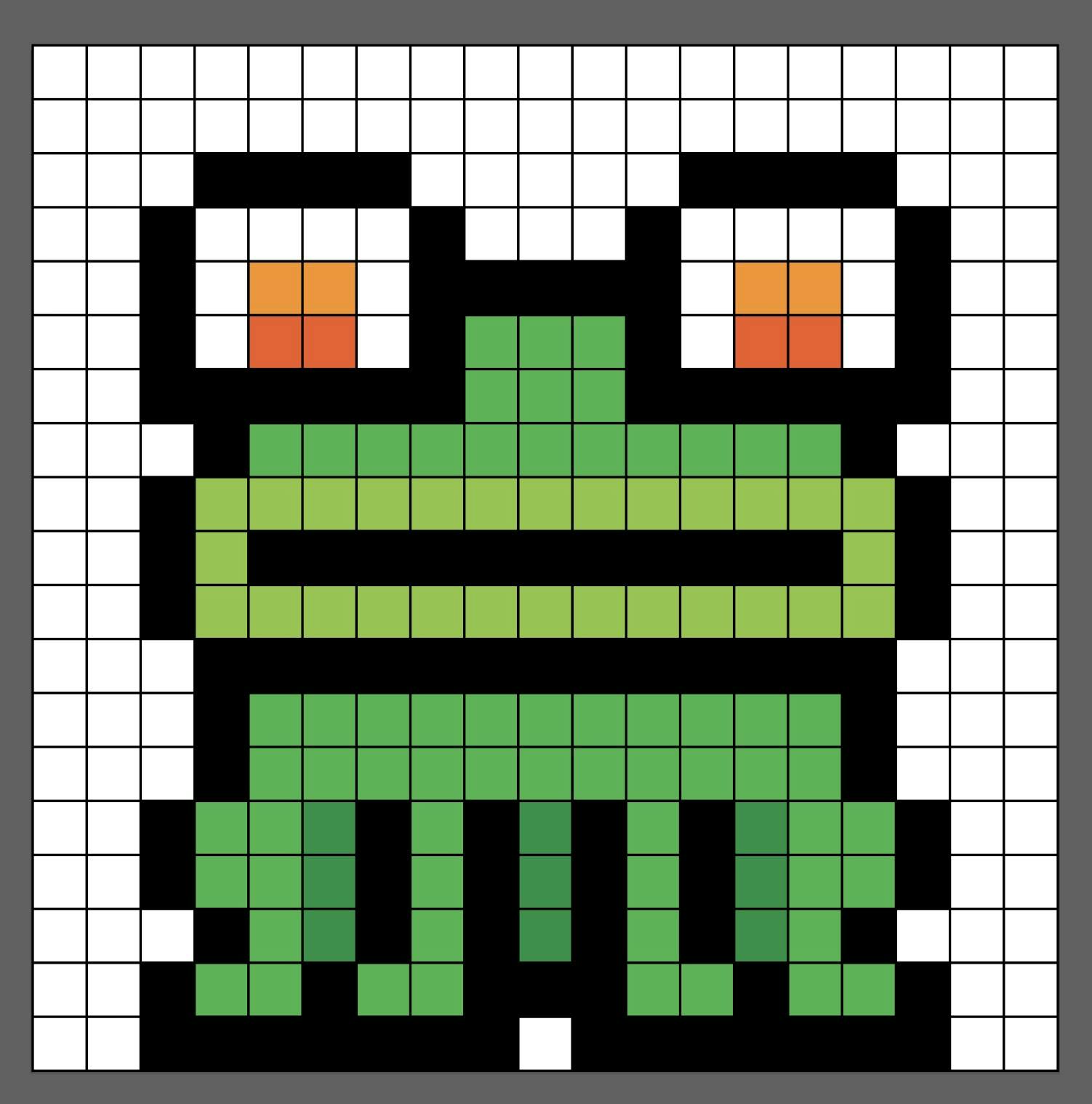
Since the box-shadow property allows us to add multiple box-shadows when separating by a comma, we'll create our own pixel grids. Let's look at this 9x8 pixel heart as an example:
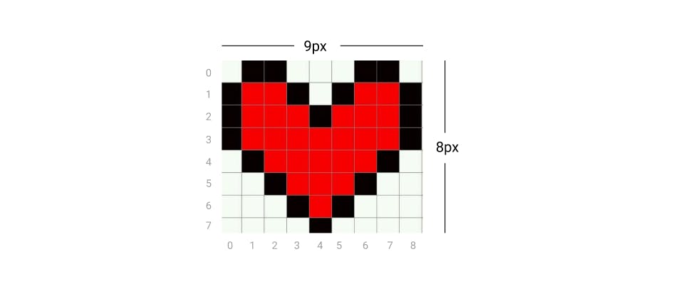
To achieve this with code, we'd need to generate a 9x8 grid with box-shadow (but only including the values with color). Going by rows and starting from the top, our box-shadow would look like this:
.pixel-heart {
  color: red;
  box-shadow:
    /* 1st row */ 1px 0, 2px 0, 6px 0, 7px 0,
    /* 2nd row */ 0 1px, 1px 1px, 2px 1px, 3px 1px, 5px 1px, 6px 1px, 7px 1px, 8px 1px,
    /* 3rd row */ 0 2px, 1px 2px, 2px 2px, 3px 2px, 4px 2px, 5px 2px, 6px 2px, 7px 2px, 8px 2px,
    /* 4th row */ 0 3px, 1px 3px, 2px 3px, 3px 3px, 4px 3px, 5px 3px, 6px 3px, 7px 3px, 8px 3px,
    /* 5th row */ 1px 4px, 2px 4px, 3px 4px, 4px 4px, 5px 4px, 6px 4px, 7px 4px,
    /* 6th row */ 2px 5px, 3px 5px, 4px 5px, 5px 5px, 6px 5px,
    /* 7th row */ 3px 6px, 4px 6px, 5px 6px,
    /* 8th row */ 4px 7px;
}
By declaring color: red, we don't have to input every color per pixel, and will only add black to the pixels that represent the heart's border:

Now that we know how it works, it's all a matter of choosing a model to recreate and dividing it into a pixel matrix.
Making Pixels Scalable
In the examples I shared so far, I directly used the transform: scale() property to make the pixels bigger. Another approach for this is using the em measurement unit for our height and width to make our final size customizable with different font-sizes:
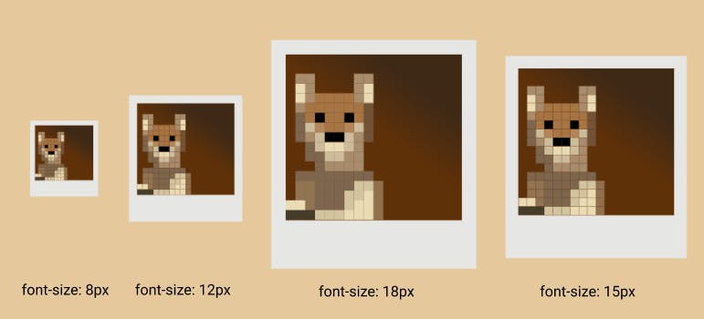
.pup {
  background: transparent;
  font-size: 18px;
  height: 1em;
  width: 1em;
}
Animating our Pixel-Art
Another thing we can do by simply tweaking our box-shadow values is animating. To achieve this, we'll go from changing some of our values in our initial box-shadow grid with keyframes.
Looking at the box-shadow for this GameBoy may be overwhelming, but for now we'll focus solely on the animation. Assuming we already have our box-shadow grid created, it all comes down to tweaking the values we want at different rates in our keyframes.
To mimic the effect of turning the GameBoy on, I created a pseudo-element on top of the complete grid. This in order to avoid copying and pasting the entire box-shadow for every percentage of the animation. This pseudo-element is the entire screen when it's turned on, and what we'll do to make it appear gradually, is color pixel after pixel:
@keyframes turn-on {
  50% {
    box-shadow:
      3em 5em red,
      7em 6em blue, 7em 7em blue, /*1st bar*/
      8em 6em blue, 8em 7em blue, /*2nd bar*/
      9em 6em blue, 9em 7em blue, /*3rd bar*/
      10em 6em blue, 10em 7em blue, /*4th bar*/
      11em 6em blue, 11em 7em blue, /*5th bar*/
      8em 9em black, 9em 9em black, 10em 9em black;
  }
}
By using our same box-shadow grid but adjusting our initial colors, we can simulate different types of animations, like this:
If you go through the code for the GameBoy or the Pumpkin, you'll notice the only change I make is in our color value, which could also be simplified by using variables.
Simplifying Things
I know it seems like plenty of work to type value after value, so one of our options to make this somehow simpler (besides copying and pasting rows) is to use SCSS for variables & maps, which I'll try to explain with different examples in an upcoming post.
If it's still too much of a hassle for you, there's a tool created by JValen that generates the box-shadow grid for your pixel-art creations. All you'll need to do then is tweak accordingly. 😉
I hope this post was useful for you and that it motivates you to create your own. If you do, please share! If you've come up with yet another approach, I'd also love to know!
You can find the rest of my CSS art up on my CodePen and follow me on Twitter for more updates.

